Twitter unveiled a new logo today, and it looks like the site is kind of pulling a Prince. It seems that from now on, the word "Twitter" won't be part of Twitter's branding: The new logo is nothing but a redesigned, simplified version of the site's iconic blue bird. If you are a regular networker than you might not be able to figure out a difference between the current one and the earlier one.
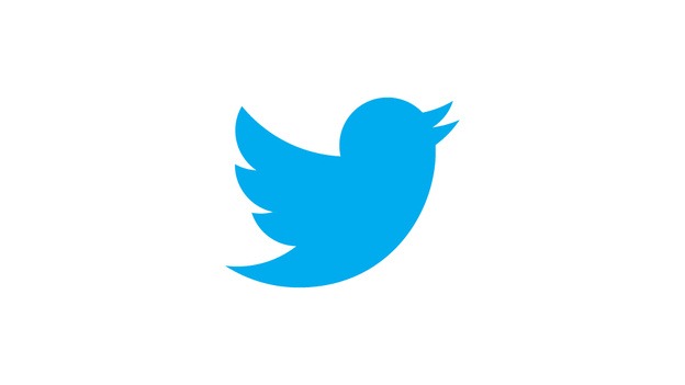
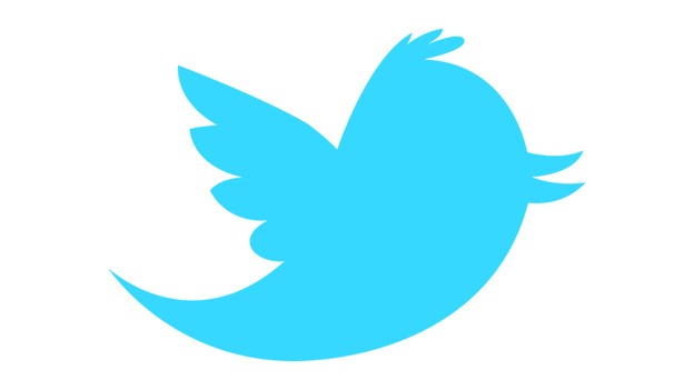
The new bird update brings some darker appeal in it changing their main color from sky blue to darker blue well obviously in that same variant. The birds beak is little bit higher positioning upwards in some direction. Well as said by the twitter team there new logo is just a creation out of 3 circles set making this new cool logo, I think the new update is pretty good its simple and easy to be scanned in any way. If you wanna check out the old one and figure out the difference check below.
So if you are a blogger you might have seen your twitter widgets button changed with the new one if not check it now. Hmm ... well did you like this new logo make sure to comment below.